The Strategic Problem
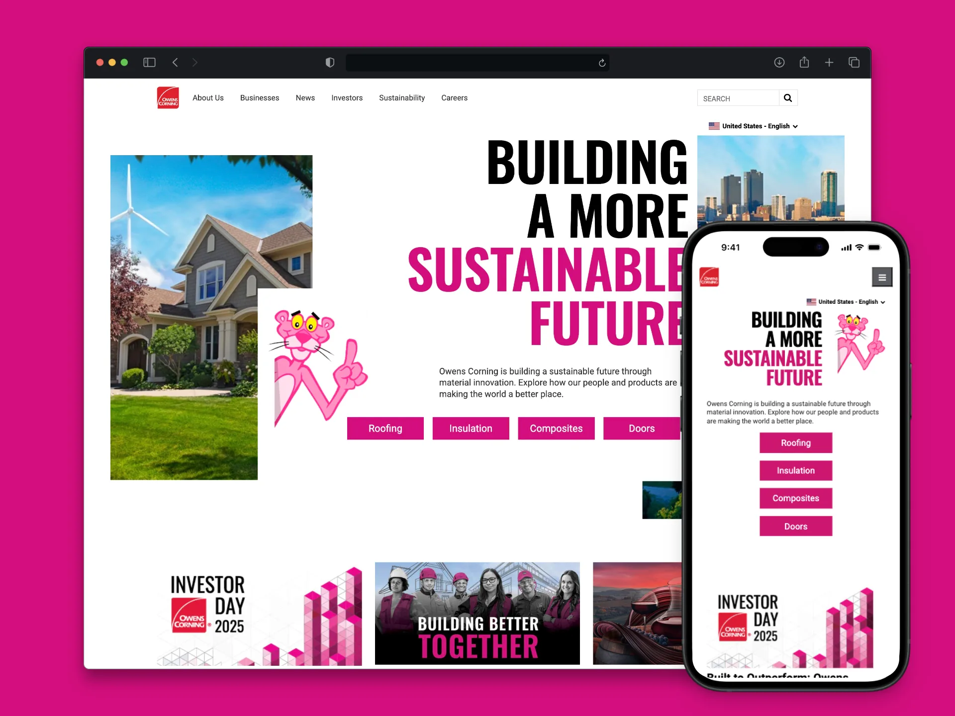
Owens Corning struggled with design fragmentation across diverse user-facing systems, leading to high operational costs and design debt. Multiple silos (Marketing, Builder, CP, OCCN) needed consolidation into a cohesive Enterprise Design System.
The Goal
Enterprise initiative to unify fragmented design systems, streamline development workflows, and prepare for brand updates across multiple user-facing platforms.
Role: Design Engineer / Design System Contributor
Bridging Design & Code Consistency

Source of Truth
Need for a living, sharable source of truth for UI components and standards.

Dev Velocity
Lack of findable and reusable components for streamlined development.

Compliance
Need to meet web accessibility standards across all platforms.
Governance & Implementation
Technical Stack
Implemented Storybook for component documentation, and Storybook plugins for contextual functionality, using GitHub for centralized code management.
Design Tokens
Launched initiative to align design variables (color, spacing, typography) with code, ensuring cross-platform consistency. Starting from primary color ramps to semantic color tokens.


Component Maturity
Configured Figma libraries, addressing redundant components and implementing robust props documentation.
Figma Organization
I took the lead on critical Design Operations initiatives focused on maturing the Figma environment. I drove the discussions and standardized requirements for Figma file covers, inclusion of a comprehensive changelog within each file and defined guidelines for improving the overall file organization structure.


Documentation Enablement
I ensured the Design System's scalability by authoring robust Confluence documentation covering component usage and interaction details. Crucially, I defined the end-to-end workflow for new component creation and formalized the process for integrating code with Figma via Figma Connect, empowering both designers and developers.
Validation and Usability Testing
Formal validation process established to ensure the system was truly usable, not just technically compliant.
1. Test & Learn
Led validation phase with Usability Research Plan and Component Library Test.
2.Empirical Data
Collected usability test data from participants building real-world UI scenarios.
3. Synthesis
Authored Usability Test Report identifying issues and recommending component updates.
Impact & Results
Strategic planning and technical work established a robust, scalable foundation that validated the team's approach and dramatically improved developer efficiency.
Strategic Success
The validation phase provided empirical data necessary to inform the final Enterprise Design System recommendation, paving the way for the company's multi-million dollar annual efficiency goal.
11,960 Hours Saved Annually
Potential time reallocation with completed Enterprise Design System.
$0.00M Annual Cost Savings
Projected financial impact per year.
Streamlined Handoffs
Aligned design and development through integrated Storybook and Figma environments.
Reduced QA Time
Established clear guidelines, leading to faster quality assurance cycles.
Achieved Consistency
Established single source of truth, minimizing redundant components across enterprise.
Key Learnings
- Prioritize the Developer Onboarding Experience: Development velocity was immediately hindered by missing peer dependencies and unclear installation instructions. Future efforts must focus on creating robust, zero-friction developer enablement tools, such as starter templates and installation walkthroughs, to boost confidence and adoption.
- Move to Structural Components: Developers needed page "recipes" and layout grids more than atomic components. Future sprints must prioritize building structural utilities and documented compound patterns to prevent developers from having to create custom CSS workarounds.
- Documentation Quality is the True Source of Truth: Inconsistent component naming and sparse prop documentation slowed component discovery. Documentation must be mandated to include complete prop tables and usage examples to minimize reliance on searching the codebase and establish developer trust.
Fabio has supported my UX team at Owens Corning for several years, consistently delivering thoughtful, reliable work. He's excellent at breaking down complex UX challenges, exploring multiple approaches, and presenting well-considered UI solutions. I've truly valued having him on our projects.

Anthony Fontana
Leading UX & Digital Transformation at Owens Corning